

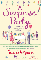
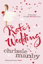
Do Judge A Book By Its Cover: The Time of My Life
Colours & Fonts: ![]()
Graphics/Pictures used: ![]()
Overall design:
Why we like/dislike it: I’m finding it hard to write something about this cover. It doesn’t tell me anything about the book, the gold portions at the top and bottom of the book make it look a bit too much like a children’s book to me, something I’d see on the 7-10 year old girl’s shelf. The pink font in the middle with the title is pretty and contrasts well against the gold, but the more generic text and gold colour of the author name means this just blends in too much. It’s a bit wishy-washy and neither here nor there for me.
Overall mark out of 10: 5
Would we buy this book based on its cover? Undecided.
Do Judge A Book By Its Cover is a new feature on Chick Lit Reviews, where we take a look at some of the best (and worst) Chick Lit covers in existence. No synopsis, no hint of the story, just plain old book cover judging, with marks out of 10!
- Digg
- Stumble it!
- Do Judge A Book By Its Cover: To My Best Friends by Sam Baker
- AW Do Judge A Book By Its Cover: Magnolia Wednesdays by Wendy Wax
- Do Judge A Book By Its Cover: The Single Girl's To-Do List by Lindsey Kelk


April 5th, 2011 at 4:15 pm
I love her books, but honestly - she has the most beautiful covers. The Book of Tomorrow was really beautiful! She has a great designer.
April 5th, 2011 at 4:16 pm
I love this cover. It’s bright, it matches her other novels (total win) and it looks as if it’ll sparkle. However, I do think more could have been made from the gold, to shape it to look like a clock or something to represent the title!
April 5th, 2011 at 4:45 pm
It’s not so much about the cover, but who wrote it! I’d ready anything by her, no matter what I thought of the cover!
April 5th, 2011 at 4:47 pm
I’m not digging it. It doesn’t really say anything or make any sort of statement.
April 5th, 2011 at 5:35 pm
I Love It! I was actually thinking this the other day
April 6th, 2011 at 6:45 pm
I bet they change it before it actually comes out.
April 7th, 2011 at 5:41 am
I wouldn’t. I think it’s incredibly plain and boring. The sparkly yellow hurts my eyes and I think the pink text looks very out of place.